PREVIEW
Below is the prototype of my flight booking website. I designed it followed UX design institute capstone projects. All the research and analysis were really helpful to establish a basic understanding of how to make the user flow smooth and easy to use. For instance, I had a standout & prominent searching box at the homepage, users can easily access the booking process. The automated departure place with nearby airport options is also a great idea I've got from previous online surveys and usability tests. Well, there are tons of functions/features I haven't added yet, but I tried to achieve hover or micro-interactions using component states in Adobe XD.
RESEARCH
User research leads to a comprehensive understanding of user experiences. Thus, I conducted an online survey with valid and insightful data for my further studies. Besides, qualitative usability testing and detailed note-taking can support my user research and further data analysis.
ANALYSIS
After I got my data from user research, I need to brainstorming and analyzing all data for my logical user flows and meaningful sketch. The methods I used are the affinity diagram and a customer journey map, both used Miro.
.jpeg)
DESIGN
It's time to come up with valid and easy-to-use concepts for the online booking website. I've created a smooth flow diagram on Miro for user experiences from searching flights to complete the booking.
Then I created all basic interaction designs on Balsamiq and tried to make sure the interactions I've added are natural or make sense.
PROTOTYPE & WIREFRAME
After that, I started to design the prototype and wireframes on Adobe XD.
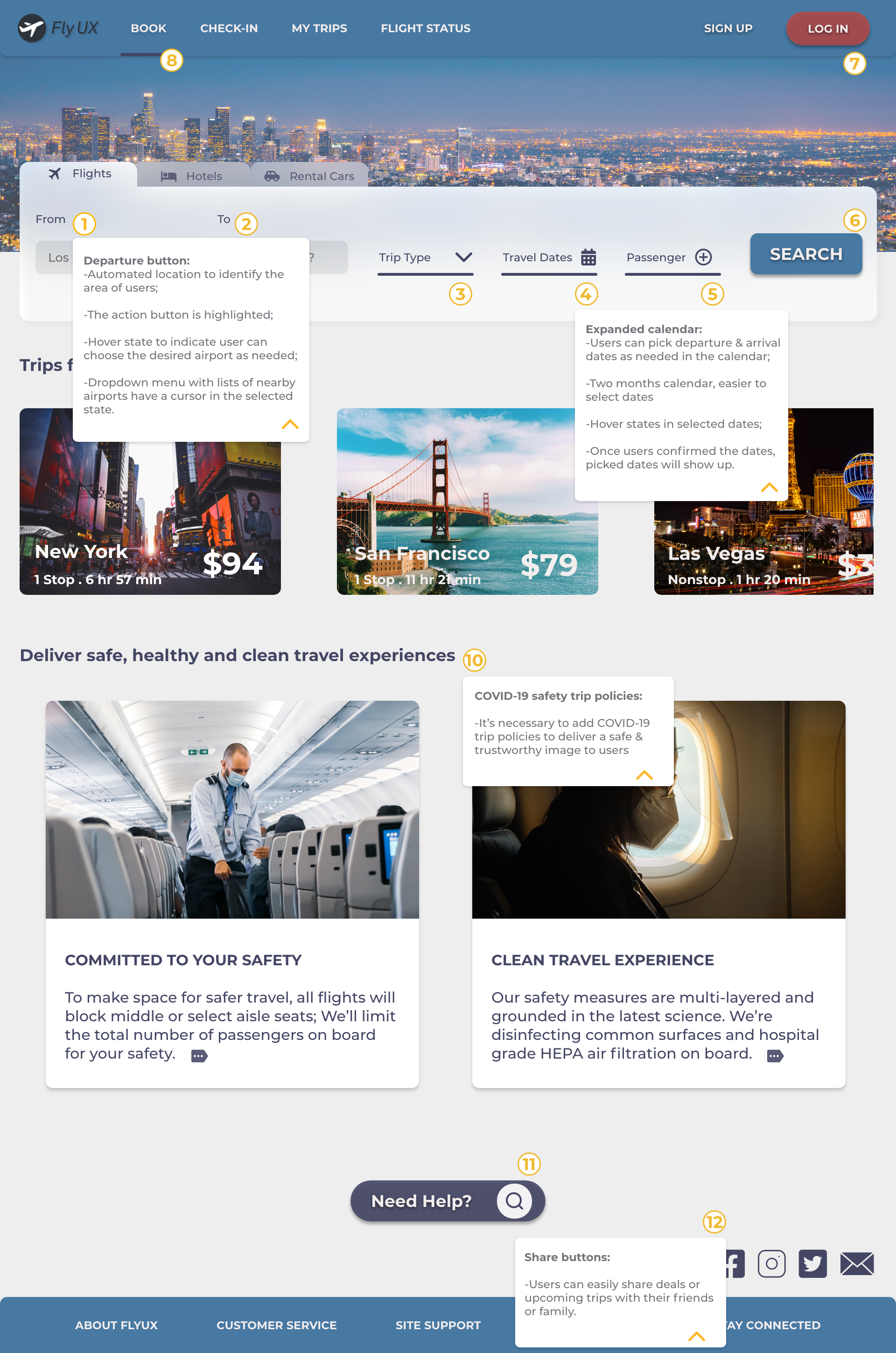
On my searching results page, I tried to have a more clear layout for basic flight info like it's a real boarding ticket. Meanwhile, I want to keep the page clean, so I arranged the different fare options like tabs, by default, the basic economy flights are highlighted.
I also added hover states for benefits or detailed info on different dare options, just in case users are curious about the differences among all fares. I'm also wondering if there's a better way to present all available flights and fare options. Whether the price calendar and sort & filter button were useful or necessary.
Once we choose the departure flight, it will jump to arrivals. On top of the page, I've added a change flight button for the user to easily go back to departure flights if they want to make changes. The rest of the process is similar to a departure flight.
Before we go ahead and make payment, I've added a trip summary page for more detailed and transparent price info and extra travel terms and conditions. Since in my user flow, I just choose the cheapest basic economy flights, which seats assigned after check-in. If users want to select seats, I need to clarify the fare benefits and price differences.
The next step would be baggage allowance for basic economy flights. I want to have a clear and easy-to-understand layout for the info. For the passenger info page, I try to make it clear and easy to type in forms.
You might notice on each page I've added a search button and share icons. Users can get help and sharing flight info with their friends or family more easily. We don’t have to log in or create accounts before users booking flights. After booking complete, perhaps I would like to add a feature to create an account or something for the user to easily check their upcoming trips or check-in status.
CONCLUSION
Overall, it's a really interesting learning experience. As a beginner in UX design, I'm happy with what I could achieve for now, but also eager to learn more and hoping I could be more professional. I want to make my screens less crowded or cluttered, even though I know the theories"Less is more" but still, like a beginner mistake, I couldn't help but keep adding the unnecessary elements. I think that's the next step I need to adjust.
More importantly, the prototype needs to be tested throughout the design process. Making improvement with iteration, it would be the golden rule to create a user-centric and easy to follow user experience design.